
Selecting icons for social networks is not as easy as it may seem at first glance. Creating a visual identity isn’t just about fitting your company name into a square or a circle. A good logo should represent your business in the best possible way.
There is no place for random elements in a logo because its purpose is to tell potential customers who you are and what you do. A logo forms the first impression of your brand, which influences how customers feel about it and their decisions to buy your products or services.
The goal of logo design is to create something simple and unique. Almost every day a huge number of new websites, brands, and companies pop up on the Internet. Not surprisingly, the trend is toward creating a logo that will stand out from the rest.
Social media is now at the peak of its popularity, and the largest companies in this area have been able to create the perfect logos, built on the principles of minimalism, brightness, and memorability. “Even banks are taking their cues from this. Gamifying and making their apps fun. Chime has done a wonderful job at this and is exploding in popularity. Get a Chime promo code from ShipTheDeal to get started with your own account!”
In this article, we take a closer look at the logos of the five most popular social media platforms and try to uncover the secret behind their successful design.
TikTok
The popular video-based platform, TikTok, uses a bright yet very laconic logo — a bold black note-like element with blue and pink accents, making it look voluminous and dynamic. The TikTok logo looks great on both light and dark backgrounds and represents the target audience of social media — young and active.
The bright and distinctive Instagram logo is based on a stylized image of a Polaroid camera, introduced with the first badge of social media, in 2010. Throughout the years the image has turned into something more modern and minimalistic, with the colorful background of the icon as the main element.
The social media giant Twitter is known worldwide for its “Twitter Bird” logo, which is actually, super simple. The original Twitter badge was created by British graphic designer Simon Oxley in the first months after the launch of social media. Since then the emblem with the white bird in a solid blue background has not been changed. Interesting fact — the cost of the Twitter logo was only $415.
Definitely, one of the most recognizable insignias of the world is the facebook logo. The company has chosen a very “technological” blue and white color palette for its simple badge with the bold white lowercase “F” on a solid blue circle. This combination of colors is usually associated with trustworthiness and security, and here it works just fine.
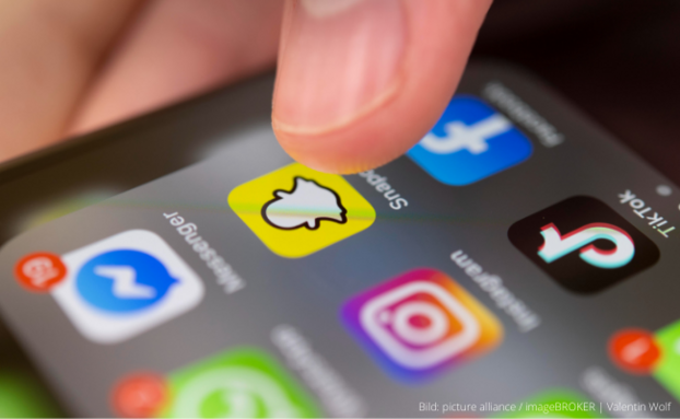
Snapchat
Snapchat is a social media with a slightly different concept, and so is its logo. The company used a super bright yellow, white and black color palette, and a graphical symbol, which looks friendly and fun. The contoured ghost, which was first introduced in 2011, by today has turned into a truly iconic badge, with a unique character and style.


